With our office in downtown Sioux Falls, in and among the long-lived buildings and looking out on the historic Washington Pavilion, the folks here at Lemonly often enjoy thinking about what came before.
Thanks to Exposure Gallery owner Zach DeBoer, a few of our designers had a chance to go beyond just thinking and dreamt up visual representations of bygone Sioux Falls places and events.
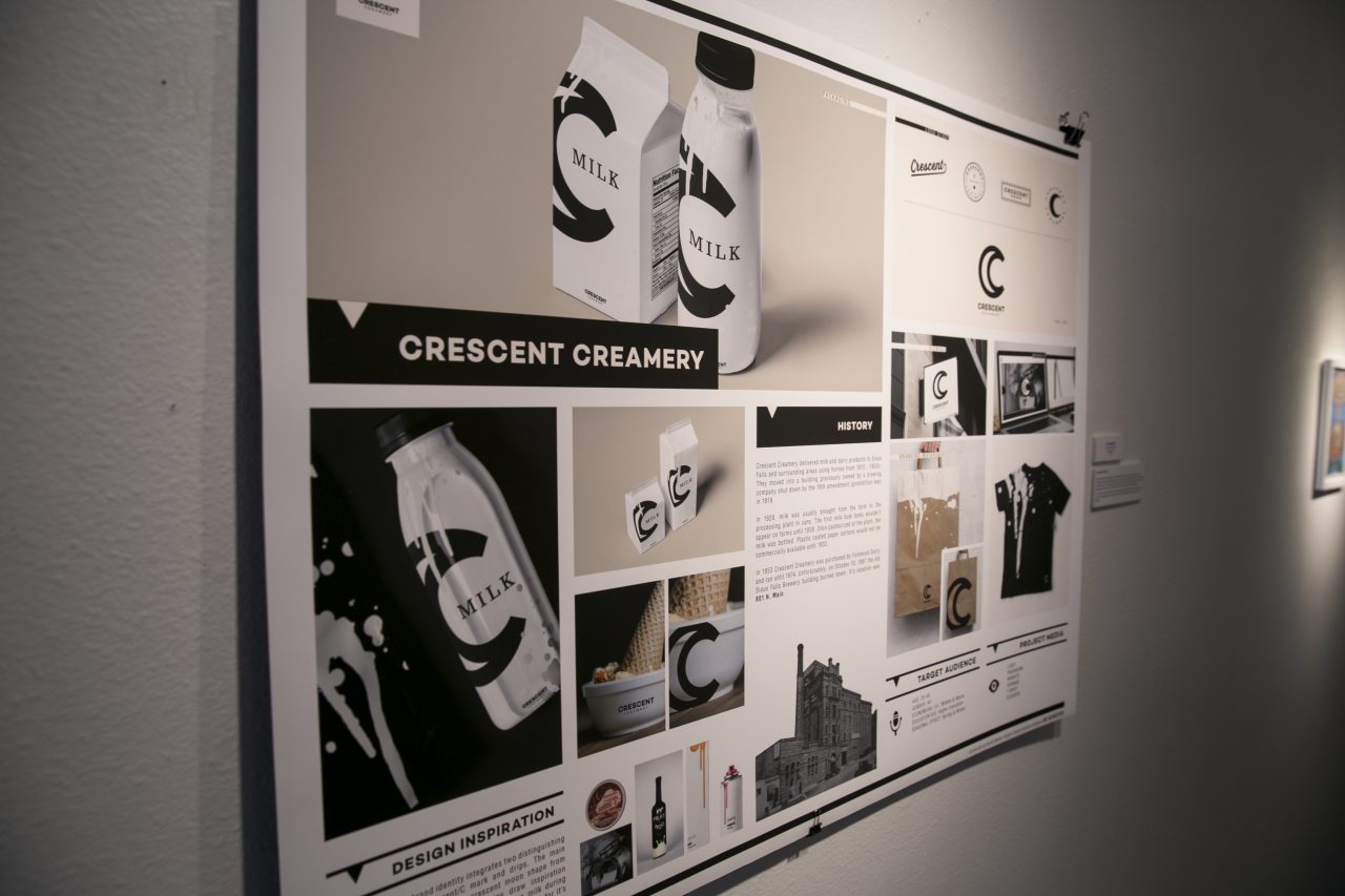
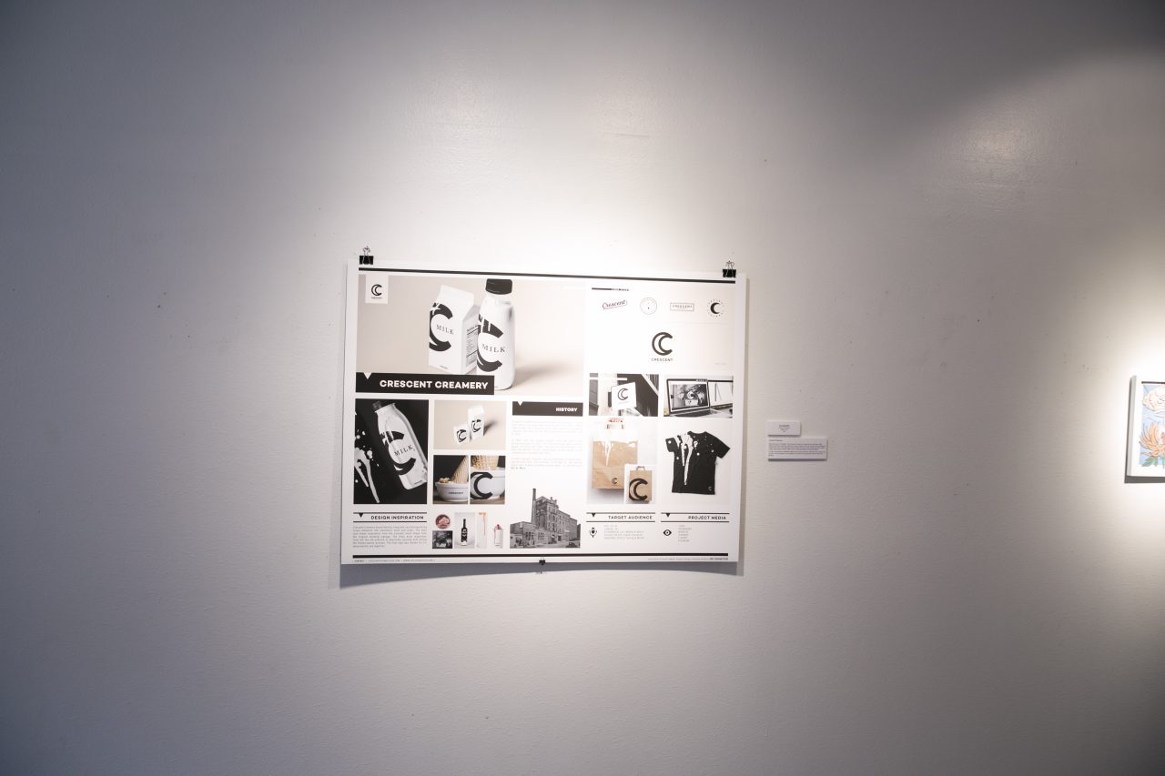
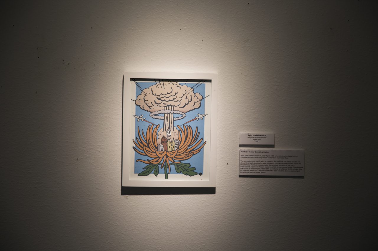
As part of Design Sioux Falls III, Zach hand-picked a list of Sioux Falls relics and assigned local graphic designers with the task of exploring and designing something that would encourage viewers to learn and appreciate our city. (See our part II recap here.) Among the local graphic designers were our very own Amy Colgan, Brett Hanes, Michael Mazourek, and Molly O’Connor.
Here’s a look at what they designed and a few questions about their work:
Which Sioux Falls relic did you get to create a work of art for?
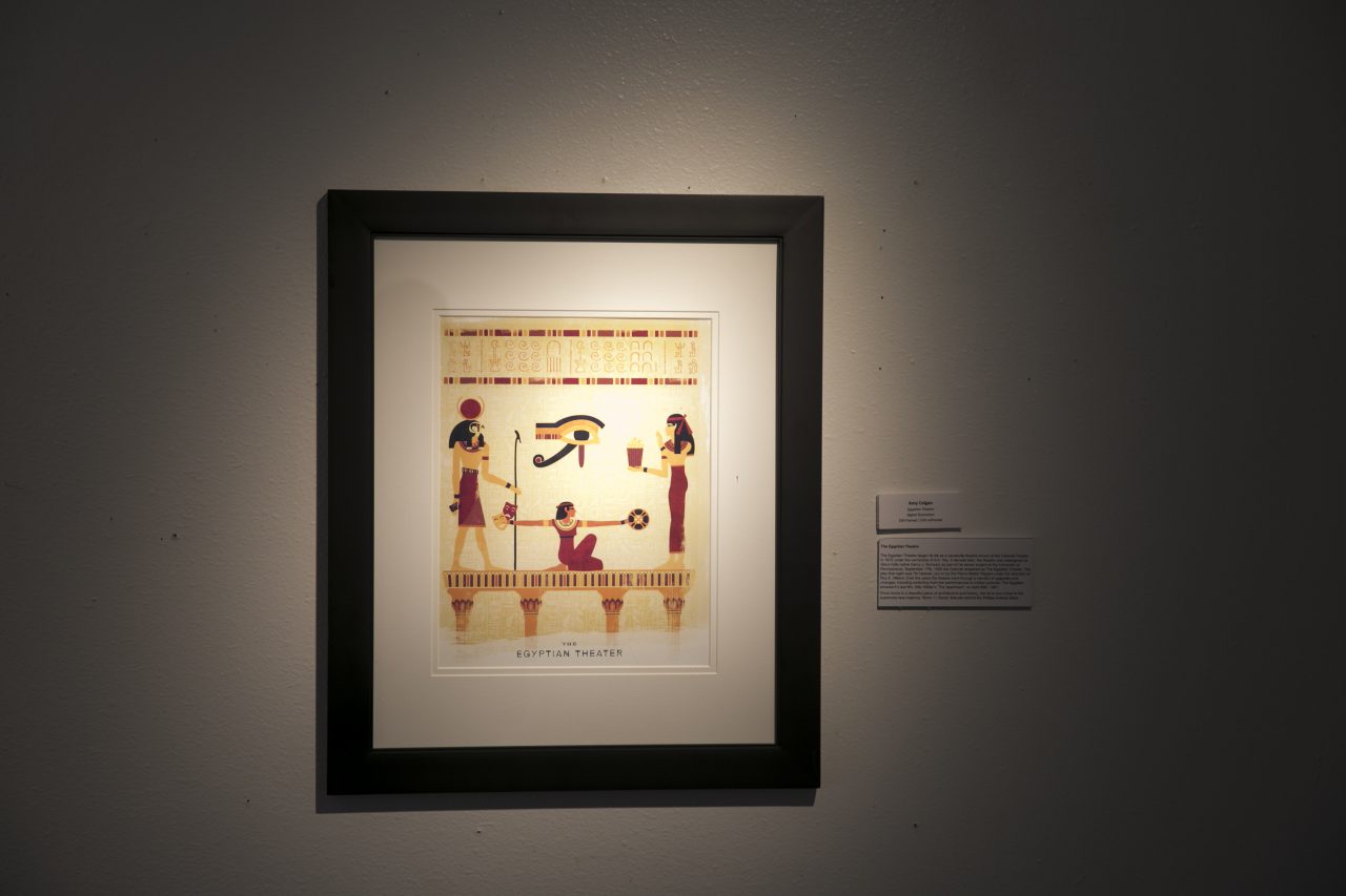
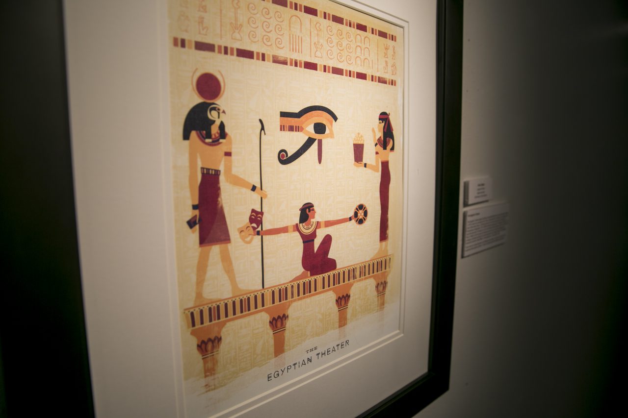
Amy Colgan: The Egyptian Theatre
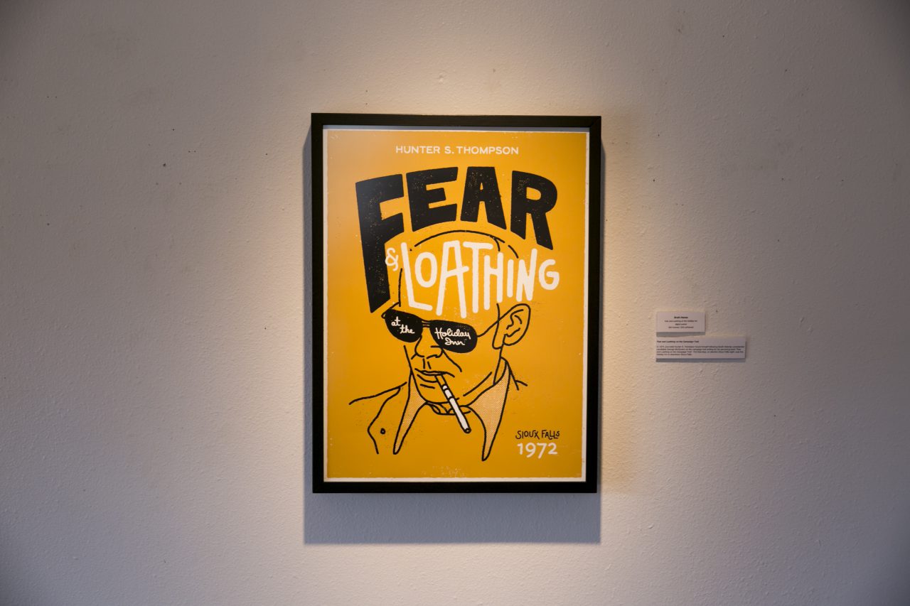
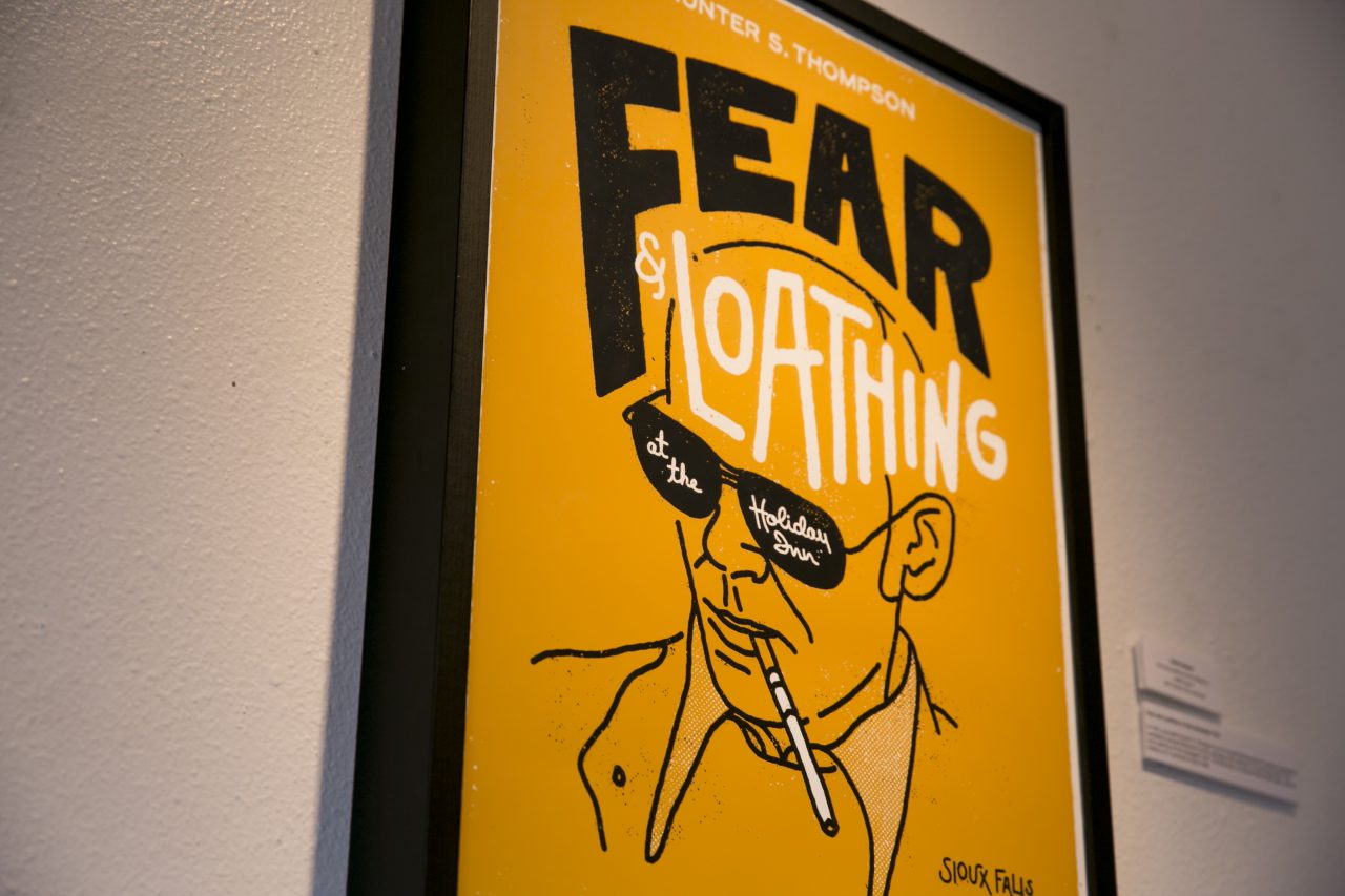
Brett Hanes: Hunter S. Thompson at the Holiday Inn
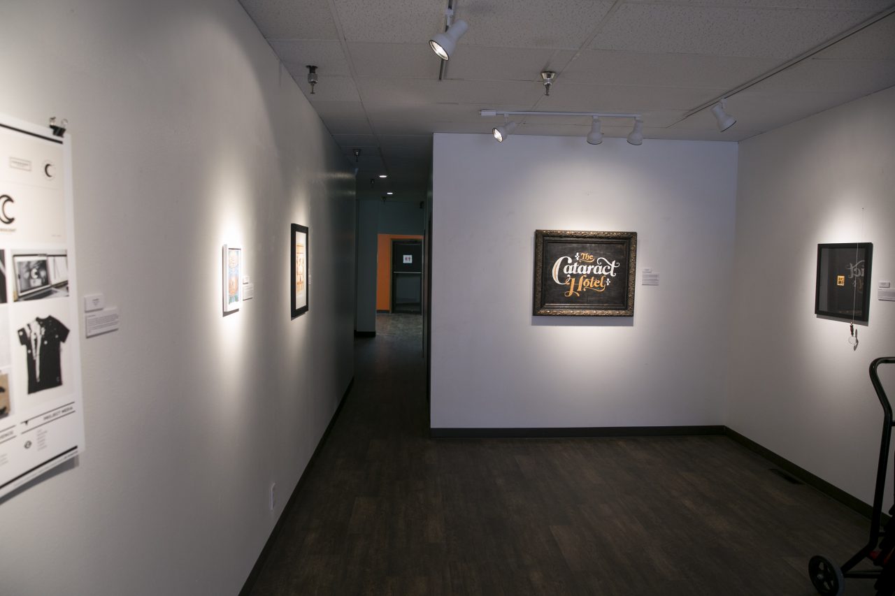
Michael Mazourek: The Cataract Hotel
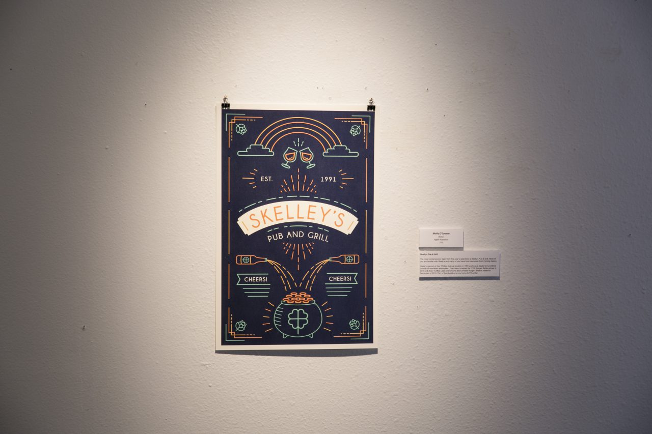
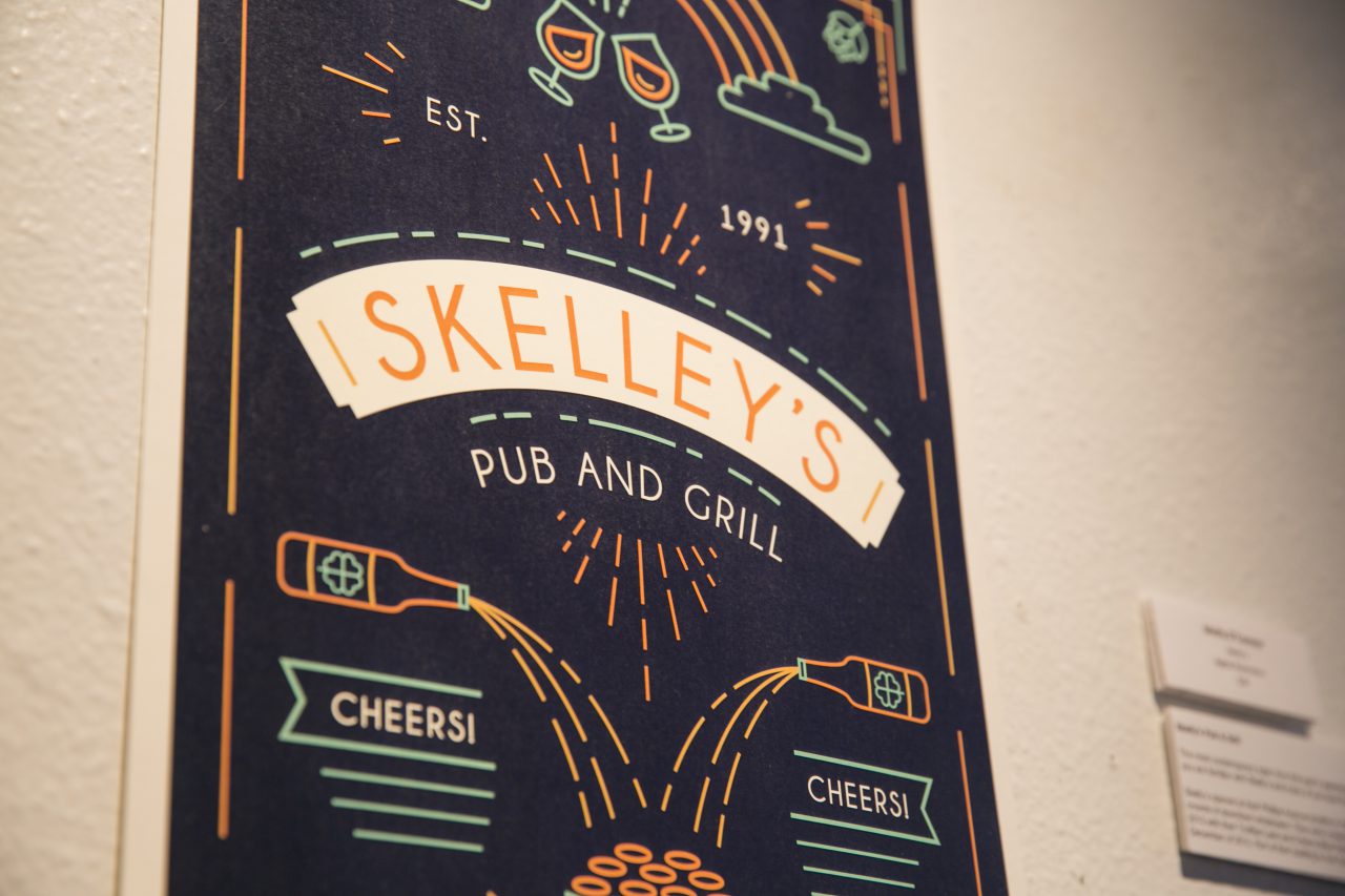
Molly O’Connor: Skelly’s Pub & Grill
Did you try a new style or go with one you knew?
AC: I went with a strong ancient Egypt influence/hieroglyphic style and added tons of textures, which is something I’m pretty familiar with.
BH: Most of the techniques I used were familiar to me, but I introduced some new ways of adding texture to this one.
MM: I decided to do a sign painting this year. I don’t paint very often, so this technique was quite unique to me. Not only did I paint my work, but I used different methods to age the painting.
MO: My work is usually illustration-based, so deciding to use text as the focus of the piece was a different direction for me.
Do you have a favorite part in your piece itself?
AC: I had fun adding subtle movie/theater elements. The color palette turned out well, too.
BH: My favorite part is the typography for the word “Loathing,” which breaks right through the head of Mr. Thompson. I had fun creating those letters.
MM: Honestly, I love the frame I bought for the piece. I bought the frame before I started painting so that I could choose colors that complemented the aesthetic of the frame.
MO: I had a lot of fun with the color scheme.
What was the most challenging aspect of creating your piece?
AC: Changing concepts. All day, every day.
BH: The most challenging aspect was figuring out how to combine type and image to form a composition that was cohesive.
MM: The most challenging aspects of my piece were making the paint crack and painting the curves of the letters.
MO: I’m not used to featuring text so prominently, so it was a fun challenge to find the right balance between the words and illustrations in this piece.
Here’s a look at more work from the show:
(Learn more about the show and Zach’s role with Exposure in our interview with him here. And check out the gallery’s new show starting tonight.)
