[Note: This is one of two design system case studies that Lemonly has produced to test two unique scenarios. See the other case study we made on a company with a large, complex creative team here.]
Meet GRO
GRO heals the mind, body, and spirit in two ways: through franchise stores full of fresh foods and through its online publication, which share healthy recipes and tips to align one’s mental wellness with physical fitness. Their customer base stretches from Boise to Baton Rouge with its headquarters in Minneapolis.
What’s working?
With a new identity the small in-house team is excited to spread far and wide, GRO is committed to implementing a more consistent look and feel through the marketing materials its stores use. Having so many customers across a wide variety of cities and towns in the Midwest, there is a huge potential to become a household name across the country.
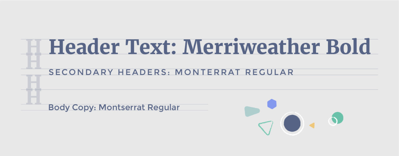
GRO’s new identity was built on top of its bedrock elements—a logo suite and a pair of fonts, Merriweather and Montserrat—carried over from previous visual guidelines.
What are their pain points?
Although the company and its franchises boast nearly 2,000 employees, GRO’s design team is small. Stores are creating their own social posts and print ads that stray far from brand guidelines, though by no fault of their own. One creative director and three visual designers simply isn’t enough bandwidth to support stores in more than 400 disparate locations.
Why GRO needed a design system
GRO’s co-founders and creative director embarked upon the path of a design system, in tandem with the launch of their new identity, in order to ensure consistency. Knowing that most marketing materials will be created by store owners who may not have experience with design, this design system is built custom to be plug ‘n’ play, with elements like email templates and sales collateral that can be easily repurposed while keeping on-brand.
The design system
Color use
GRO’s new identity includes a broad, colorful palette that celebrates a diversity of clients and the unique dietary needs for each individual.
Since the design system is built to be more plug ’n’ play, assets are built with a more evenly weighted array of colors. Additionally, patterning off the structure of GRO itself, three primary colors serve as the anchor, but a number of ancillary colors represent the many franchises.
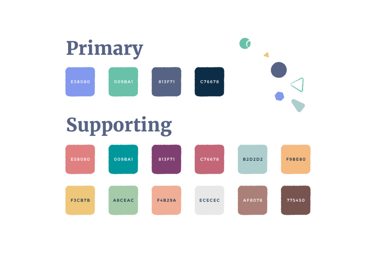
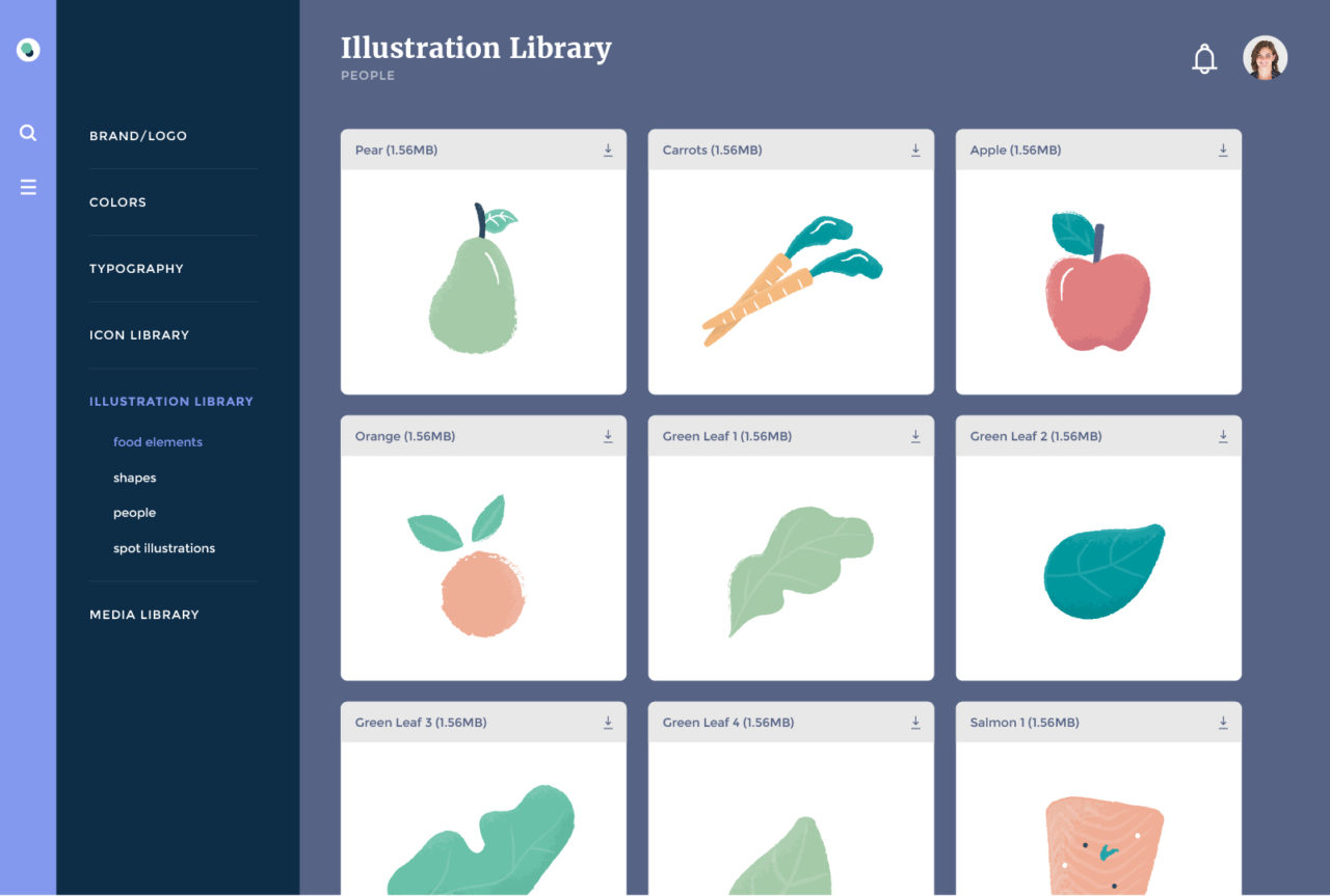
Illustration library + guidelines
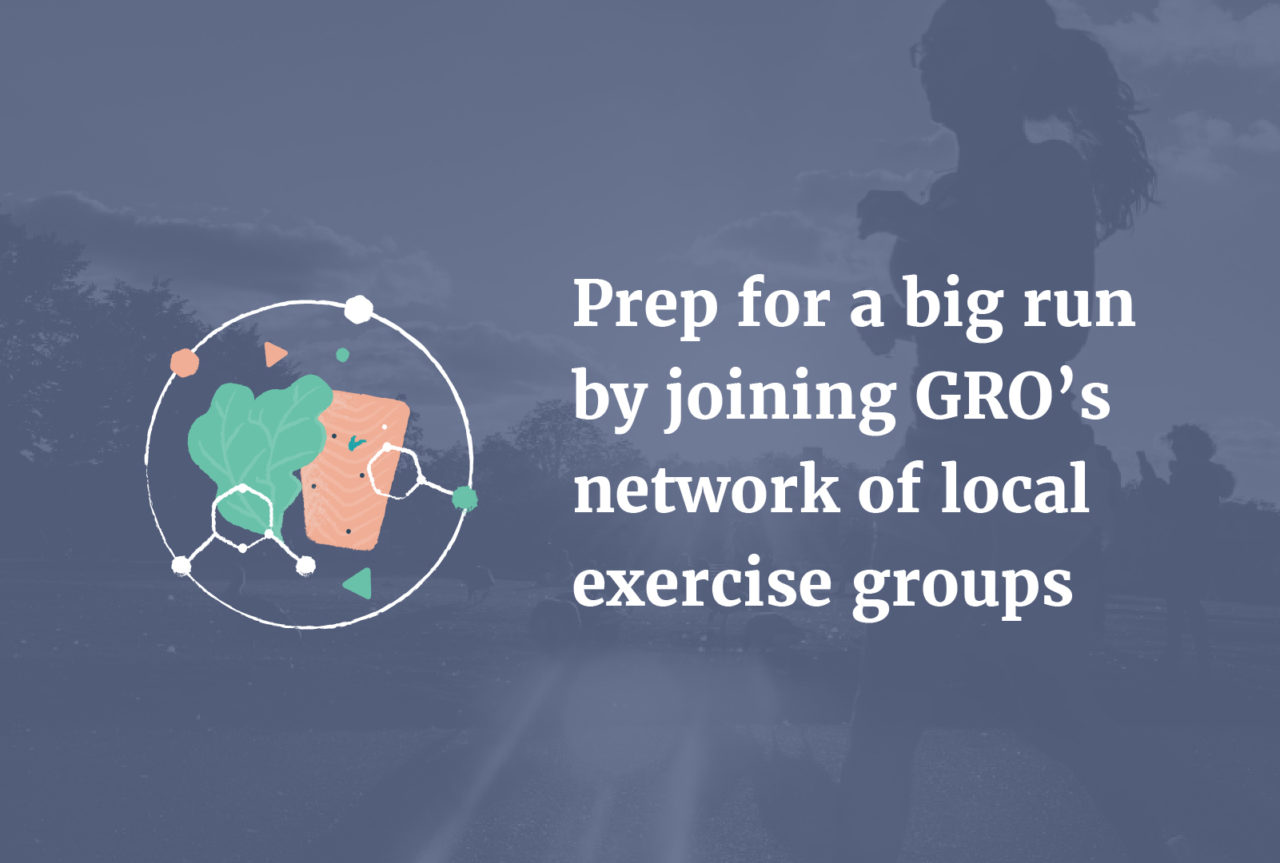
Shapes are rounded instead of sharp to highlight the welcoming nature of the GRO community. Textures are applied to line and shape to create a more genuine, imperfections-are-good feeling.
And to draw a connection between science and nature, organic, free-flowing contours are paired with geometric structures.
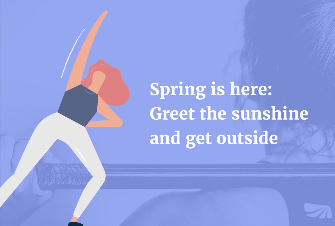
Character style
To help achieve a naturalistic portrayal of bodies and ensure proper sensitivities are shown, figures are not illustrated as being overly obese or skinny in a cartoonish manner, but rather show a wide representation of humanity.
Promoting an active lifestyle, the GRO design system depicts characters who get out and get after it. And to reach the multifarious personalities who take part in GRO’s diet and health plans, there is an emphasis on displaying diversity in skin tone, hair colors, and ethnic backgrounds.

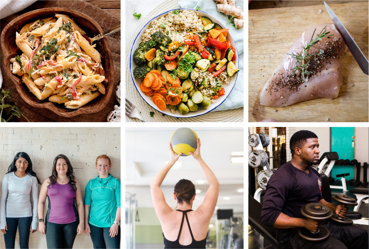
Photo library
Accessibility is of utmost importance for GRO, a brand that appeals to a broad range of people. Therefore, the design system outlines rules that ensure legibility of text on images.
A mix of subjects in the photos included in collateral also lends the resulting marketing materials a sense of creativity and diversity.
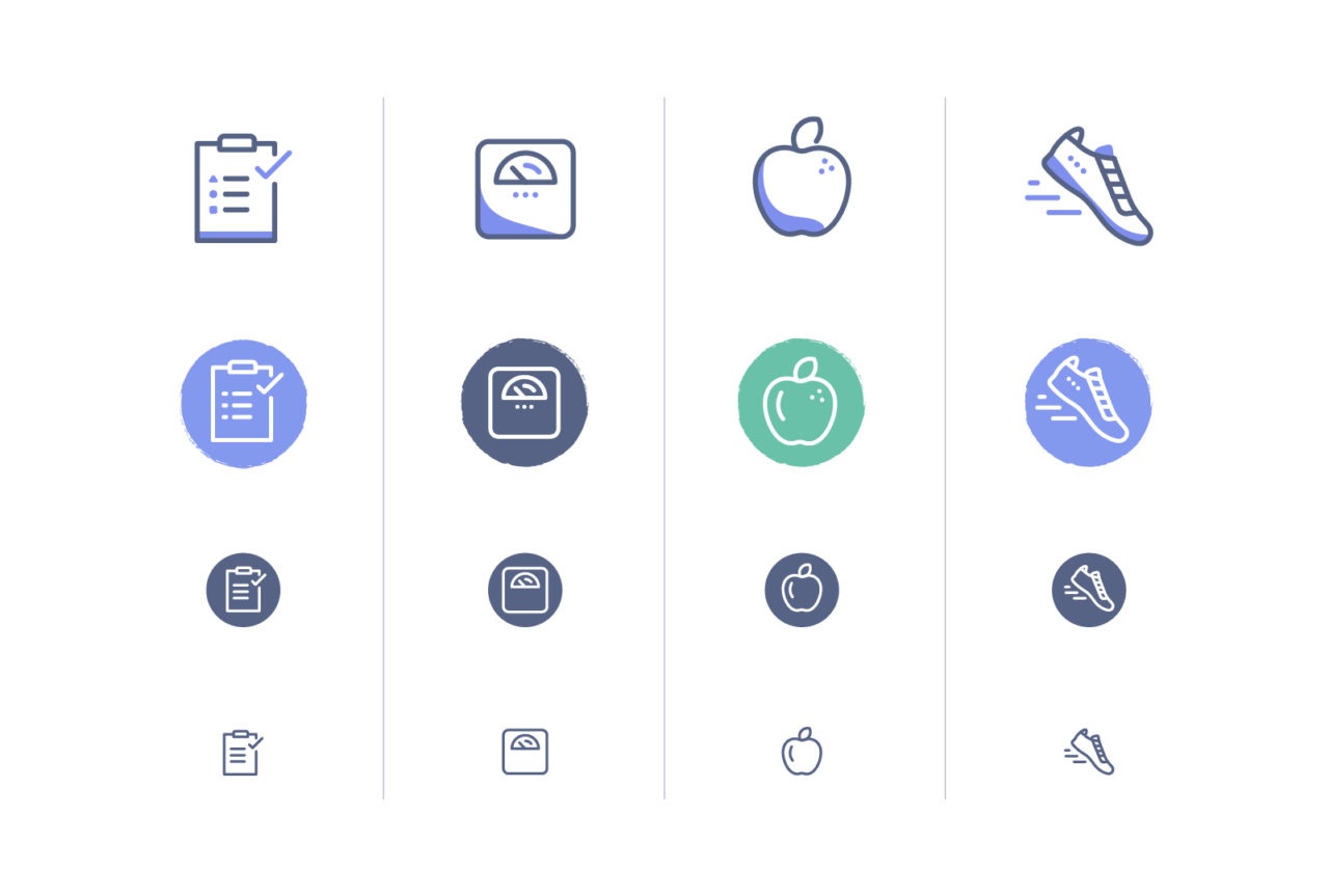
Icon library
To stand out from the broad colors in illustrations and photos, icons are limited to two colors from the primary palette.
This helps create an easily understood visual language that communicates both value and trust to customers quickly and in a friendly manner. Clean, geometric forms with round edges align with the simple shapes found in larger illustrations. And to further backdrop the immediately recognizable icons, textured edges are found only in background elements.
Dashboard
Hundreds of store owners can quickly overwhelm GRO’s small design team, so to prevent a glut of emails asking for this illustration or that photo, a custom dashboard was created to serve as a central location from which anyone, technically proficient or not, can submit a request, which Lemonly helps to manage and answer.
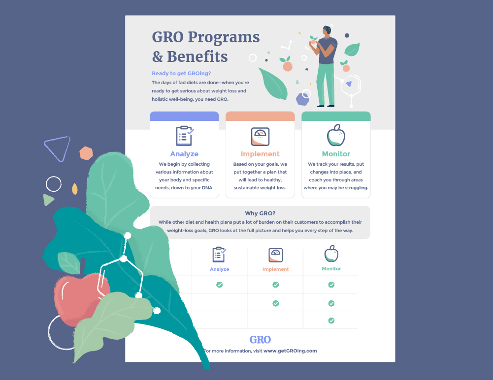
Sales collateral
For curious folks who might not want to commit to a new program right away, GRO’s design system also includes sales pieces such as this one-pager that any store can order to be printed directly from the dashboard and sent to their location.
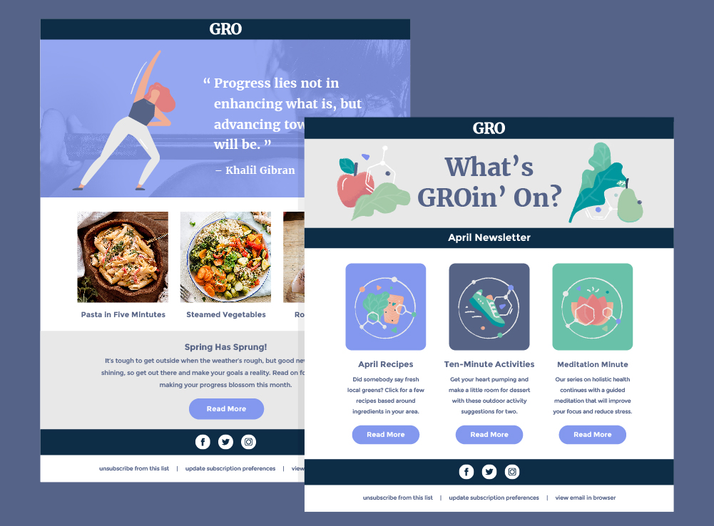
Email templates
Considering the many stores that GRO operates and the many customers each has, it can be difficult to keep in touch on a one-to-one basis. So to stay top-of-mind for everyone from top-of-funnel to bottom, email template make mass communication simple for all franchisees looking to purvey the latest products and plans.
Social posts
Also through the dashboard, store owners can create approved imagery for social posts by picking a template, a photo, and writing text to go on top, within the guidelines’ boundaries as far as character limits to ensure maximum legibility without needing a designer to assist.
To sum it up…
All in all, the GRO test project represented a unique challenge, separate from the larger company we envisioned in Sprocketeer, the other design system case study Lemonly produced.
Yes, some teams have numerous designers on staff who crave a design system to improve their efficiency and carry out the mundane tasks so they can focus on bigger ideas. But other organizations like our invention of GRO have small creative teams and thus need a design system to aid non-designers in the creation of marketing materials.
