Once upon a time, web developers of the world shuddered at the thought of animation.
Sure, there was Flash, a powerful tool in its own right. But when the iPhone burst onto the scene providing no support for Flash, well, mobile-loving designers were forced to look elsewhere. And without a working knowledge of Silverlight or After Effects, movement was hard to come by.
Thank goodness for CSS3. With the advent of keyframe and transition support, elements within a website can be manipulated naturally. And somewhere, the spirit of Walt Disney is smiling.
Below, we’ll list five examples of well-done CSS animation. This post follows our roundup of simple, inventive GIFs, and precedes a series-ending entry on integrating multimedia in sites. For more on the medium which brings them all together, interactive infographics, read Lemonly’s in-depth e-book Why Interactive Infographics?
We’ve enumerated the pros and cons of GIFs: detail being the good, and longer load times being the bad. CSS animations are accompanied by the reverse situation. While the options for movement are somewhat stiff — improving over time, and being hacked to their greatest potential by innovative developers — performance is tops, especially when it comes to simple point-to-point shifts.
Need to see it to believe it? Here’s our batch of sweet CSS animation precedents:
1. WhatsApp Worth
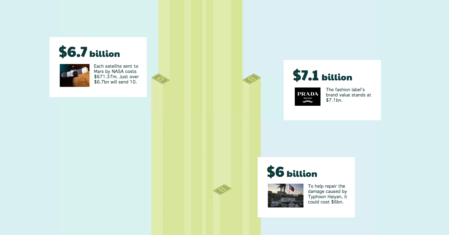
We start with the simplest animation of all: linear movement. Piling up billions of dollars, Branded3 concisely illustrates how small the earnings of giants like the Harry Potter franchise are in comparison with the gobs of money Facebook paid to acquire messaging service WhatsApp.
The top of each cash tower acts as an anchor for info boxes that fly in from the left and right. Linking the animation with scroll points allows the user to control the action. And when it comes to soaring stacks of money, who doesn’t want to be in control.
2. Every Last Drop
Slightly more complex, Every Last Drop is an interactive infographic that follows a rosy-cheeked redhead through his daily routines, counting the litres (this site is for an English audience, after all) of water he uses.
From the more minute rotations of the minute hand on a clock to the all-together-now set changes, this scroll-driven narrative hooks its readers through a flat design that moves exquisitely.
We’re just curious why the redhead doesn’t wake up with bed head.
3. CUPS Annual Report
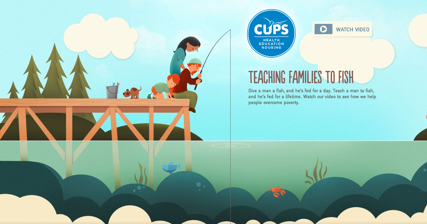
OK, what is it with redheads playing pivotal roles in these sites? (Note: The author of this post is gingerly biased.) Thanks to a well-woven overarching metaphor — “teach a man to fish, and he’s fed for a lifetime” — this annual report for CUPS succeeds in the finer details.annual report for CUPS succeeds in the finer details.
Scroll down to hook the family’s meal, and scroll back up to see it snatched away by a bigger fish. Watch the puppy wag its tail, and the water ripple outward from the fishing line. Icons and other illustrations further down the page pop into action, breathing life into the story.
Past the apple pie, our catch for the day is laid down upon a plate. Dinner is served.
4. Century of the Child
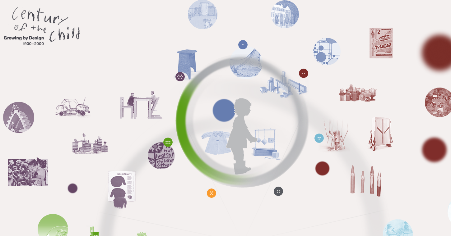
Expectations run high for the Museum of Modern Art, what with all the groundbreaking works of art it houses. But when it comes to interactive features, MoMA surpasses the bar set high with Century of the Child.
At the center of the landing page, a child’s walking pattern is set to motion by a sprite, which is cycled through by changing the container’s background-image position. Once you enter a section of the virtual exhibit, the site maximizes on CSS animations by complementing its navigation with pixel-perfect transitions.
Click to focus on one piece, and the rest fall away smoothly. Move down the line of pieces, and additional timeline points float in from above. Now if only all museums could be so innovative.
5. DangerousRobot
And lastly, for a full-on feature of CSS animations, web development shop DangerousRobot presents their origin story: a gear-riddled, zap-driven romp through their mascot robot’s “creation.”
What the storyline might lack in plausibility, it makes up for in character. White-coat-wearing employees jitter, shock themselves and give up all hope for their future. With job titles like Supreme Leader and Master of the Shapes and Color, it’s clear that seriousness is not a priority for these coders.
And CSS animations, in all their straightforward playfulness, therefore offer the perfect solution for fun-seekers.


