
Lemonly Lemonly 2012 Annual Report Design
Infographic2012 was one sweet year for the Lemonly team. Take a look at our 2012 Annual Report design to see just how many sweet visuals we made and what new additions we had to 2012.
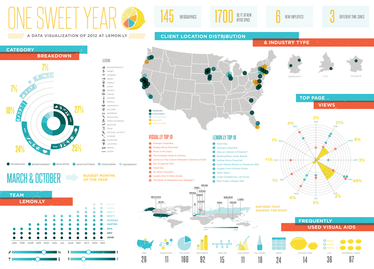
2012 was one sweet year for the Lemonly team. Take a look at our 2012 Annual Report design to see just how many sweet visuals we made and what new additions we had to 2012.

