A Tale of Three Infographics: Static, Animated and Interactive
This is a story about infographics. Three (hypothetical) infographics, which represent each of the three types that Lemonly makes.
Want the long (and fun) or the short (and simple) version?
Alright, we’ll get straight to the point. Every infographic we do shares a common goal: display an idea or a piece of information in a clear, aesthetically appealing way. But since each project can be executed on different platforms, require a unique timeline, or attempt to hit specific objectives, they can come out of the funnel looking a lot different. Here’s a rundown on the three main categories our infographics fall under — see which one lines up with what you’re goin’ for.
It starts on another normal Monday.
You make your coffee, get dressed and head to the office.
You work in Awesome Products, LLC.’s marketing department, and it’s on you to make sure the new Thing sells as well as the latest Whatsit. A tall task, to be sure. But this Thing is awesome. It has five screens or something. Use your imagination. Your audience is gonna love it. You kick your feet up for a few months, take care of other stuff — the promotion plan can wait.
Before you know it, launch is only a few weeks away. Uh oh. You hit up Awesome Products’ internal promo team and give them the rundown. Not exactly a groundbreaking solution, but they usually do well enough.
They don’t do well enough.
A few weeks pass. Sales aren’t great. You’ve blown through your advertising budget, but the campaign of banner ads and radio commercials isn’t working. Benchmark dates are coming soon — you’ve gotta get those numbers up. You’ve secretly taken out a second mortgage and bought a garage full of Things to fudge the figures. It’s looking grim. Your boss comes to your desk and uses some words my boss won’t allow me to repeat. You’re not sleeping.

A few more weeks later. It’s 4:00 a.m., and you’re scrolling aimlessly through an article that slaps an unsightly label on the Thing: World’s Greatest Flop.
The glow of your laptop screen hurts your eyes, but it doesn’t matter. Nothing matters. Hardly anybody is talking about the Thing, and when they are, it’s not pretty.
“The Thing is worthless.” ”I don’t even know how to use it.” “Its name is too generic.”
Something isn’t connecting. You know your product is solid, but customers either haven’t heard of it, aren’t buying its value proposition or simply don’t understand the way it works. If only there were a marketing execution specifically equipped to solve all three of those problems.
Psst. There is.
You rack your brain and remember a presentation you saw a while back about the rise of infographics. Or was it a blog post? Regardless. A little more research about what they do well and you come to the conclusion one might be worth a shot.
“Infographic design agency,” you request of Google. You need something fresh, and you need it fast. You wind up on Lemonly’s website and decide to see what we can do.

When someone says the word “infographic,” you probably think of a static one. Static infographics use visuals — illustrated, photographed, or some of each — to simply share complex data, explain an idea, or spread a message.
Most static infographics are posted to landing pages on our clients’ websites or blogs, but they can also be formatted for print. They typically take us 3-4 weeks to complete, and cost less than more complex pieces. Check some out!

You call us up and ask if we can help. Of course! We go through the process, decide on a microcontent series of social images that link back to a more robust infographic on your blog, add an illustrated one-sheeter to send to tech journalists and boom — you’ve got yourself a web of content that’ll clear up confusion and drum up conversation.
We get it done, then sit back and watch.
Now that you’ve bridged the gap in your target market’s mind, you stop the bleeding and then some. Sales rise. Your boss gives you a “good work” and a nod.
Months go by before some big news! The Thing is getting a software update that adds a bunch of new features. You remember what happened at launch — confusion, stagnation, depression, your garage, should I continue? — and determine that this time, you’ll leave a little more time to perfect your plan.
Management has lengthened the leash in wake of increased sales, but they’re still keeping a close eye on the marketing budget. Understandable.
Your boss stops by. “What else can those lemon people come up with?”
Glad you asked.
You still need to clearly convey the new updates. You need it to be on brand. You need it to be even more awesome than the last go-round. We’ve got just the thing.
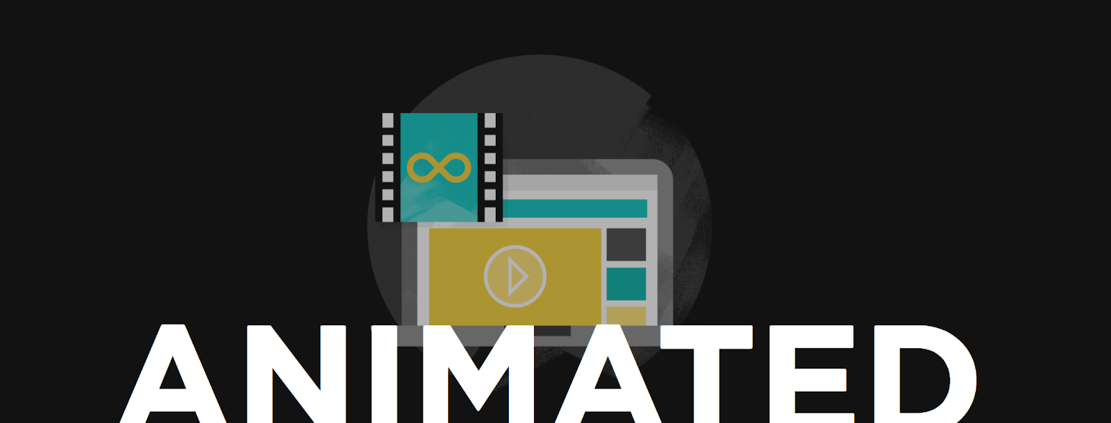
An animated infographic can look a lot like a static one — at first. When you tap play, start scrolling, or look closer, smooth transitions and eye-grabbing animations assure you this is no ordinary infographic.
Animated infographics can take the form of simple, shareable GIFs or short videos that work wonders when it comes to explaining more intricate topics or ideas. Depending on the project, we can usually crank out animated infographics in 4-8 weeks. See examples here.

Everybody’s on board. Let’s do this. Our video and GIFs make explaining the new software’s advantages to your users a breeze, bring in new customers, and get people buzzing about your brand. Everything’s turning up you! Look how far you’ve come.
Flash forward six months. Leadership has been so impressed with your marketing decisions that they’ve given you a promotion, a bigger budget, and a sick Mercedes. Sure, it’s flashy, but you deserve it. You put your garage Things on eBay. You’re not about to park the Benz on the street.
You return from a Caribbean cruise to an email. A huge tech website has asked you to write a piece on the Thing’s smashing success story. You happily accept the offer, but ask if you can go outside the box. Being the savvy marketing mind you are, you see an opportunity to leverage the column for a bit of branding. And this time, you want to show off a little.
We like that.

Here’s where things start to get really fun. Interactive infographics can include embedded videos, audio, hyperlinks, and animated graphics — making for a more immersive, more memorable experience.
Interactive infographics can even function as standalone microsites, giving you flexibility on top of beautiful visuals and clear, concise information. When it comes to interactive work, the sky’s the limit. Your budget, too, but we’ll talk about that later. If you’re looking for the ultimate in visual communication, you want one of these. Take a look at ’em.

You call us up and tell us to go bonkers. Video, sound design, the kitchen sink. Looks a little something like these — or however else you want it to, really.
It kills, of course. Have you seen some of the stuff our designers can do? It’s ridiculous.
Everybody lives happily ever after.
Fin.
Now, we’re not saying this is exactly how the story of your first projects with Lemonly will go (but it could!). But if you’re looking for a way to inspire conversation or easily explain a complex idea, you’re in the right place.
More questions about what we can do? Check out all our past work or schedule a call with us to talk over what you’ve got in mind. We’d love to chat!
