Chapter 4
How interactive infographics work
Dynamic elements
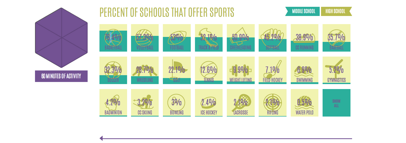
To start to understand interactive infographics, let’s begin here: Imagine a compendium of U.S. high school and middle school sports offerings. If a bar graph were made showing the 24 most common sports and percentages of both high schools and middle schools offering them, about 60 percent of the content would be hidden “below the fold,” past the bottom edge of a browser. Users would need to scroll down back and forth to see the all of the data.
If instead we employ the tools of the web, the sections containing the school's details of sports offerings can occupy the same space, virtually sitting like a stack of cards in the digital world. In short, the entirety of an expansive dataset can be accessible without having to scroll down a single pixel.
For Lemonly, interactivity was exactly the solution as we sought to inform the client IOM’s audience about percentages of school sports offered by schools. By allowing a user to unlock, discover and absorb information by clicking on the percentage points individually and all in one place, we could more elegantly present the data. Plus, interactivity earned us the added benefit of better engaging the user and having a longer time on site.